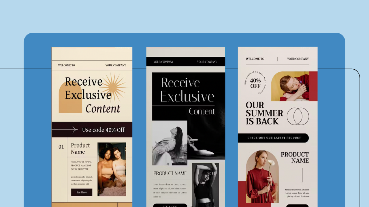
Email marketing is a powerful tool that helps businesses connect with audiences, drive brand awareness, and boost sales. However, with so many emails flooding inboxes daily, it’s easy to get lost in the overflow of online traffic and exclusive promos—all competing for your audience's attention.
Although many components, such as timing, segmentation, and personalization, play into the psychology of why users click on one brand email vs. the other, your marketing email's visual design and layout are just as essential.
Are You Using Email Design Best Practices?
Quality email designs can grab your audience’s attention and increase engagement.
How It Works
An example would be using design to help break up text-heavy emails. So, rather than having subscribers read a multi-paragraph newsletter over 500 words, you can incorporate design elements and visuals to help create appeal and navigate their eyes to scan key information easily and immediately.
Remember, humans have an attention span of about 8 seconds. That means you have a small window to convince them to read more and click through.
Equally important, pairing design with content creates a memorable experience that differentiates you from other brand newsletters. It can also improve the user’s comprehension of your message.
The Impact of First Impressions
Like a website, the design of an email is the first step in building relationships with your target audience(s). It sets the tone for the rest of the email’s content and can impact the user’s interest in exploring more.
To put it simply:
- A poorly designed email can turn off potential customers and lead to a high unsubscribe rate.
- A well-designed email can capture their attention, encouraging them to engage (click links that direct to relevant pages on your site, shop with exclusive promo codes, or contact you for a service).
Top 10 Email Marketing Design Tips
Follow these 10 email design best practices to create visually appealing emails that grab your subscribers' attention and increase engagement.
1) Feature Eye-Catching Hero Images
Let’s first talk about your email header design or, more specifically, the hero image and text overlay. As the first visual your reader sees upon opening the newsletter, it can be the difference between an email that gets read and one that gets deleted.
Always incorporate a quality, high-resolution image as the centerpiece of your email to grab attention and encourage readers to keep scrolling. Just be sure the image is relevant to the email’s messaging. You can also utilize graphics for your email header design if it aligns with your branding.
Remember that if you include a text overlay, keep it to the left vs. center and ensure it doesn’t cut off essential components of the image (i.e., a person’s head) or blend in with the image's background.
2) Avoid Generic Photography, If Possible
Speaking of images, don’t be afraid to include high-resolution photos in other email sections. Again, ensure they’re relevant to the content of your main message. But, if possible, avoid using stock images that are overused or generic, as they can make your email appear unoriginal.
Instead, consider using custom images, branded photography, or graphics unique to your company to help convey your message more effectively. Additionally, ensure your images are optimized for email and load quickly, as slow-loading images can negatively impact your open rates.
3) Utilize Margins and Padding
Margins refer to the space around the border of an element, whereas padding is the space within the border of an element. Ensuring you have ample white space between different content elements is one of the simplest and most effective ways to direct attention and make emails easier to read.
It helps create clarity and contrast and ensures emails don’t look cluttered.
4) Make Mobile Responsiveness a Priority
With most people accessing their information on mobile devices, you must ensure your email design elements are optimized and responsive across all marketing channels, not just desktops!
This means using a responsive design that adjusts to different screen sizes. Mobile optimization can also create a seamless user experience, allowing them to click through to your website or make a purchase—starting from the newsletter.
5) Keep It Simple and Easy to Read
When it comes to email designs, less is often more. Keep your designs simple with a clear information hierarchy. Use a single-column layout and avoid cluttering your email with too much text. A purposeful balance of text and design should allow users to scan the information while directing them to critical areas.
You can achieve this by including:
- Intriguing headers
- Bullets
- Videos
- Graphics
- Images
Be sure to use a font size and style that is easy to read on desktop and mobile devices.
6) Remember the F-Shape Pattern
As Americans, we’re taught to read from left to right; however, because our attention span is only 8 seconds, we also like to scan reading materials.
As a result, we start to read content in a horizontal line (left to right), but as we begin to scan, our focus stays to the left until we reach the bottom of the page (or newsletter).
Therefore, when drafting your email, introduce the most critical pieces upfront and use the less important information at the end. Finally, keep headers on the left-hand side vs. center to help users scan for sections that most interest them.
7) Use Visual Hierarchy
In addition to putting the most important messaging at the top of the newsletter, you’ll also need to consider the proper placement of design elements.
Visual hierarchy is the arrangement of design elements that guide the viewer's eye to the most critical information.
You can create a hierarchy that leads the viewer's eye using visual cues such as size, color, and placement. This can significantly increase the chances of your subscribers taking a desired action, whether making a purchase, referring a friend, or signing up for an event.
8) Include Compelling CTAs
Pay attention to the placement of your CTA buttons when designing emails for maximum impact. Because you want viewers to identify and access your primary CTA quickly, we recommend placing them at the top of an email and once again at the bottom.
Also, include secondary CTAs throughout the text that lead to other relevant content resources, such as a case study or blog post. This will increase user engagement and conversions in your campaigns.
9) Don’t Forget about Branding
Branding consistency across all marketing channels, including email, helps to build brand recognition and trust with your audience. Therefore, ensure your email design aligns with your brand’s overall messaging and tone to create a cohesive and memorable experience for subscribers.
Simply put, you want users to recognize your emails instantly and associate them with your brand. Though you may use a different tone of voice (perhaps more conversations or witty than you would use on your website), the visual elements should be consistent.
10) Test Email Designs
By testing different variations of your email design, you can determine what works best for your audience and make data-driven decisions to improve your campaigns.
This may include testing different subject lines, images, colors, and layouts. Optimizing your email design based on your A/B test results will improve your open rates, click-through rates, and overall ROI.
Want More Email Design Best Practices?
Whether you need help testing email campaigns for maximum return or expertise in building a competitive campaign strategy from scratch, we have the tools and experience to support you.
From content planning and creation to email design, automation, and A/B testing, our team will work to grow your email list and transform your subscribers into loyal brand ambassadors.
To learn more about our email marketing capabilities, call or email us today to schedule a consultation.

